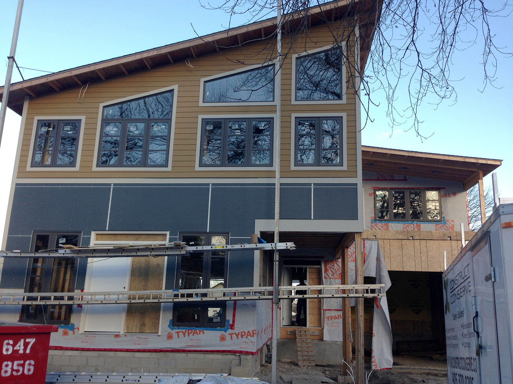
Dreamhouse Front exterior
The post Design Week: The Exterior – It’s reveal day! appeared first on The Dreamhouse Project.
]]> Today is the final day in our Design Week series! We’ve taken you behind the scenes on the exterior, from inspiration, material choices, and the many, MANY decisions on colour. Now it’s finally time to see how it’s all coming together. So without further ado…here it is!!It’s still a work in progress but we’re absolutely LOVING how it’s looking so far! It’s kind of surreal to watch the colour rendering come to life over time. If you remember yesterday…
and now…
Pretty cool right??
Check out the fine details on the Hardie materials…
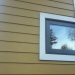
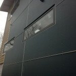
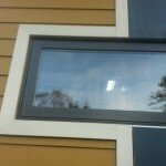
The south wall is almost complete and then they’ll be making their way across the back of the house. We’ll update you with more pics as more progress is made.
One last look before we go..
The only thing we’re still a bit on the fence with is the trim. I do love the contrast, but we’d spent so much time envisioning it in a darker grey, I think we’re still not quite 100% in love with the lighter colour. I don’t know it’s growing on me, but I think I have to wait till its all complete & then decide. Who knows – maybe we’ll make it a PARA paint project in the spring…
So what do you think?? Do you love it? Are you a fan of the high contrast trim or should we tone it down with some paint? Leave a comment below & weigh in!
The post Design Week: The Exterior – It’s reveal day! appeared first on The Dreamhouse Project.
]]> https://thedreamhouseproject.ca/2013/12/06/design-week-exterior-reveal-day/feed 3The post Design Week: The Exterior – Colour choice craziness! appeared first on The Dreamhouse Project.
]]> The amount of colour choices that go into the exterior of a house is ASTONISHING! I always anticipated that the interior design decisions would be hard but it never crossed my mind that choosing colours for the exterior materials would make me want to tear my hair out. Grab a cup of coffee cause this might take a while… When it came to the overall exterior colour scheme for the house we had a general idea of what we wanted. We have a slight obsession love affair with the colour grey so we knew that no matter the material, a good portion of the house would be grey. And since we were initially entertaining the idea of cedar, we had a warm golden brown in mind as well. We figured for the stone we could find something that picked up bits of the other two to bring it all together. If you remember our initial conceptual rendering, here’s where we started:
When it came time to pick the actual exterior colours we thought being so prepared would make things easy…we were wrong! The first colour decision actually proved to be the most stressful – the windows. Because of the manufacturer lead time, the windows needed to be ordered first. In the overall colour scheme however, the window frame colour doesn’t make as much of an impact as say, the siding. So choosing that first, is essentially like picking your accent colour before finalizing the main one.
When you order vinyl framed windows they come in white. If you want them painted using one of the manufacturer’s standard paint colours, it’s an additional charge. If you want them painted using a custom colour, it’s another additional charge. If you want both the interior AND exterior frames painted, it’s yet another charge. You can probably see where this is going…
We knew we wanted dark frames, but how dark? Do we go for black? Brown? The standard grey? Do we spring for custom & get a dark grey? How dark? And how dark is too dark? Believe it or not these are all questions that came up in actual multi-hour debates conversations.
Kes’ first choose was black. For starters it was offered as one of the standard colour options and we knew we wanted black frames on the interior which would mean saving a bit of cash. Because GOD FORBID we should want 2 different colours inside & out. That of course would be – that’s right – another charge.
Kes really liked the contrast & thought the way the frames stood out was striking & sexy. I on the other hand was NOT a fan of this look. For me, it was just too harsh. Kinda like a really pretty girl with WAY too much eye liner on. We tried a few of the other standard colours but couldn’t agree on any. The brown was too chocolatey, the grey had too much taupe in it, and none of the others really worked. Finally after finding out that there was only a minor cost difference between having 2 different standard paint colours and having 1 standard & 1 custom, we opted for the latter & chose a custom colour for the exterior frames called ‘Peppercorn.’
With the window colours finally sorted, we moved on to the exterior cladding. For the panels, the closest Hardie colour to the grey we originally had in mind was one they call ‘Boothbay Blue.’ For the siding, even though cedar was now off the table, we opted to keep with our original golden brown, with a colour they call ‘Tuscan Gold.’
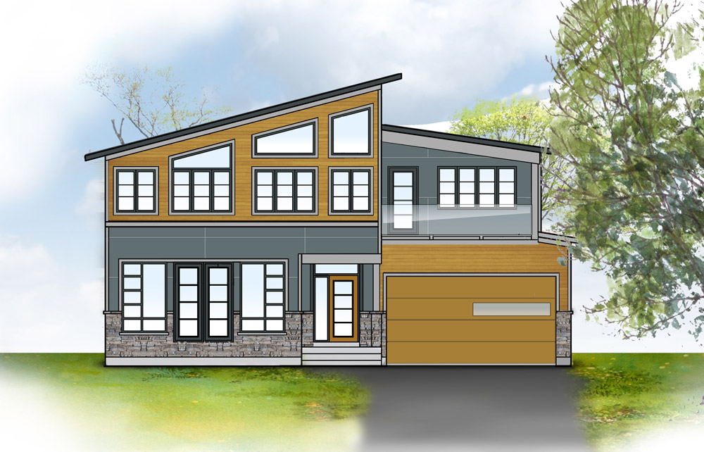
Conceptualized rendering of HardiePanel system in Boothbay Blue with aluminum expressed joints. HardiePlank siding in Tuscan Gold
The JamesHardie products are actually engineered specifically for various climates - which means that not all of their colours are available in all locales. Thankfully this didn’t pose a problem for the colours we wanted for either the HardiePanel system or HardiePlank siding. The HardieTrim, however was another story. Surprisingly not one of the available trim colours was even remotely close to the grey we had pictured all along. Of the 10 available trim colours (all various shades of TAUPE), there were only 2 that seemed to have any potential with our colour scheme…Sigh….
After a lot of back and forth, we settled on ‘Cobble Stone.’ It’s a much lighter colour than we wanted, but we’re hoping that we’ll be able to choose a stone that will tie it all together. From there all that was left was the soffit & fascia, which was the only decision we didn’t even have to think about. THANKFULLY, we were able to order them in a colour called ‘Charcoal’ that matches the ‘Peppercorn’ almost identically! PHEW…colours chosen. Case closed. Exterior in the books. Right??
Wait for it…
Just our luck – the day we went to put our order in, our supplier told us that the ‘Boothbay Blue’ we’d chosen for our HardiePanels was on backorder. Crap! But not all was lost, they offered to give us a discount on the ‘Evening Blue’ that was in stock – and as it turns out – we actually liked it better when we saw the actual product sample! Score one for us!!
So with the exception of the stone, which is still TBD, here is where we ended up after everything was ordered…
So what do you think?? Did we make the right choices? Come back tomorrow as we wrap up Design Week and reveal the progress pics of the install to give you a first look at how all the colour choices came together!
The post Design Week: The Exterior – Colour choice craziness! appeared first on The Dreamhouse Project.
]]> https://thedreamhouseproject.ca/2013/12/05/design-week-choosing-exterior-colours/feed 6The post Design Week: The Exterior – Mixing Materials appeared first on The Dreamhouse Project.
]]> After narrowing in on the look we were going for, we set out to finding the right materials to accomplish it. As it turns out – we simply live on the wrong coast. Who knew?? Apparently the exact type of house we love is so popular on the other side of the continent that it’s coined it’s own style. A quick google search of ‘West Coast Modern” and you’ll know what I’m talking about. We found a ton of information on expressed joint panel systems, & cedar cladding materials in the Pacific North West, but were hard pressed to find building practices & materials for that style of home locally.Many, MANY google searches, builder forums & manufacturer websites later, we found that we could use HardiePanel fibre-cement vertical siding to achieve the look. By simply installing it horizontally with a recess or express joint between the boards, the HardiePanel is transformed from traditional to modern.
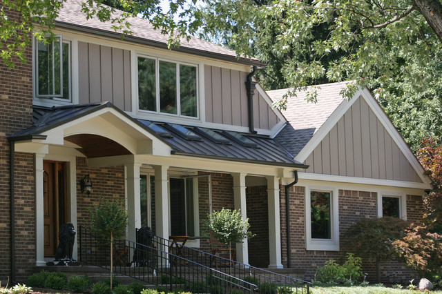
Traditional installation of HardiePanel vertical siding via houzz
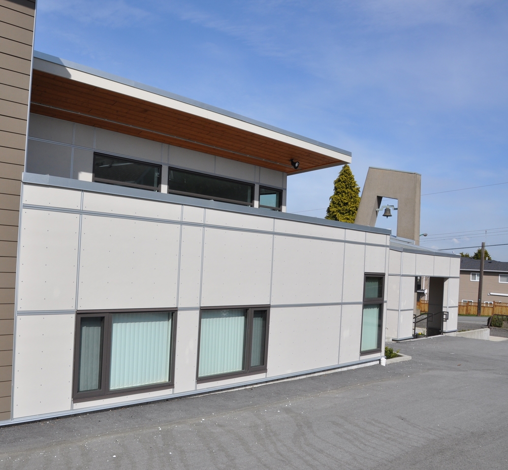
Modern HardiePanel siding with EasyTrim via stormxconstruction
With the panels sorted, we set out to source our siding. It didn’t take us long to figure out that as beautiful as cedar siding is, it was going to be cost prohibitive for us (not to mention the maintenance that would be required to keep it looking pretty year after year). As an alternative, we opted for HardiePlank fibre-cement lap siding.
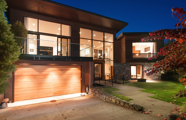
Contemporary exterior with stone via househunters.ca
There’s just something sexy about the right mix of materials. Sharp lines & industrial cladding, mixed the with earthy feel of stone somehow speaks to me. So to ground the whole exterior look, we’ll be including a hint of stone across the bottom third of the house. We haven’t quite made our final decision on our choice of stone veneer just yet but maybe we’ll put it to a vote in a later post.
Any suggestions on a stone product you’ve had good experiences with or one you think would work with our design? Let us know!
The post Design Week: The Exterior – Mixing Materials appeared first on The Dreamhouse Project.
]]> https://thedreamhouseproject.ca/2013/12/03/design-week-exterior-mixing-materials/feed 8The post Design Week: The Exterior – Achieving the look appeared first on The Dreamhouse Project.
]]> Today kicks off our second Design Week and this time it’s all about the exterior of the Dreamhouse. When we left off last time, we revealed the conceptual elevation drawings & first colour renderings of the exterior. Of course drawings are easy. The hard part is bringing the drawings to life to achieve the look we want within budget.Going back to our look book, it was pretty clear to us that the we’re drawn to houses that step outside the bounds of typical “builder beige” brick & aluminum siding. That’s not to say that there aren’t some beautiful homes built using those materials, but with our love for the modern aesthetic, we knew we’d be looking to use materials that lend themselves less to the traditional.
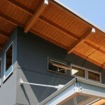
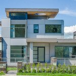
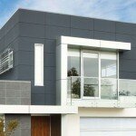
We absolutely love the modern sleek look of composite or fibre-cement panels mixed with cedar siding.
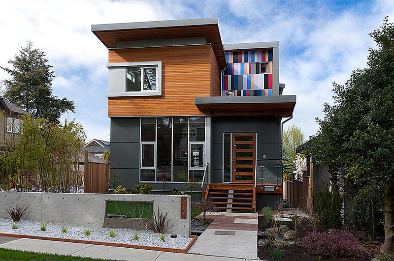
Gorgeous modern home w/ cedar siding & fibre-cement exterior cladding via drkdesign
So we had the look. We knew what we wanted. The challenge now was to find the right materials available in our market & climate to bring it all together AND to do so within budget.
Stay tuned tomorrow as we get into the specifics of the materials we chose…
The post Design Week: The Exterior – Achieving the look appeared first on The Dreamhouse Project.
]]> https://thedreamhouseproject.ca/2013/12/02/design-week-exterior-achieving-the-look/feed 2The post Back at it! Plus an exterior sneak peek… appeared first on The Dreamhouse Project.
]]> Happy Thursday folks – and Happy Thanksgiving to all our Ameri-friends!First of all, I feel like I should apologize for the radio silence over the last couple of weeks. Between broken laptops, business trips, a sick pre-schooler & some much needed family time, there hasn’t been a whole lot of room left in my schedule for the blog. I know…BAD blogger!! Not to worry though cause I promise to make up for it.
Next week be kicking off our second edition of Design Week! If you remember the first edition, we left you with a first look at the the house plans & the colour rendering of the exterior. Well next week we’ll be taking you in-depth through the Dreamhouse exterior & what felt like 5 million decisions on colour & materials that went into it.
AND just because I’m in a good mood (maybe it’s all the holiday nostalgia from watching this morning’s Macy’s Parade), I’ve decided to leave you with a sneak peek at some of the awesomeness we’ll be going through next week…
So what do you think? Are you as excited as we are??
The post Back at it! Plus an exterior sneak peek… appeared first on The Dreamhouse Project.
]]> https://thedreamhouseproject.ca/2013/11/28/back-exterior-sneak-peek/feed 2